
Speaking in Color: How Artists Use Color to Express Emotion
Feb 21, 2026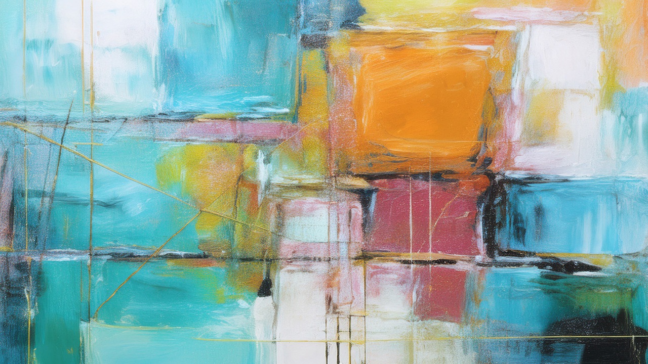
Before a single line is drawn or a shape is defined, color is already speaking. It enters the viewer’s awareness instantly, bypassing logic and moving straight into feeling. Long before we analyze a painting, we sense it. We feel warmth or distance, calm or tension, openness or restraint. This is the quiet power of color. It communicates emotion in ways words often cannot.
For artists, color is not simply a decorative choice. It is an emotional language. Each hue carries psychological and cultural associations that influence how a piece is experienced. Soft blues and greens often evoke calm, introspection, or melancholy. Warm reds and oranges tend to suggest passion, urgency, or vitality. Yellows can feel joyful or anxious depending on their intensity. Purples may feel mysterious, reflective, or spiritual. These associations are not rigid rules, but they form a shared visual vocabulary that artists can work with intentionally.
Beyond individual colors, emotional meaning emerges through relationships. A single blue placed beside a warm orange feels very different than the same blue surrounded by gray. Contrast creates energy and tension. Harmony creates rest and ease. When colors clash, the viewer often feels unrest or conflict. When they blend gently, the experience becomes soothing and contemplative. Through these relationships, artists shape the emotional atmosphere of their work.
Saturation also plays a powerful role in emotional expression. Highly saturated colors tend to feel bold, loud, and immediate. They command attention and often communicate intensity, excitement, or urgency. Muted and desaturated colors, by contrast, tend to feel quieter and more reflective. They can suggest nostalgia, tenderness, restraint, or subtlety. Choosing between vivid and softened tones is often a choice between emotional volume and emotional intimacy.
Value, or the lightness and darkness of color, adds another layer of meaning. Lighter palettes often feel open, hopeful, and spacious. Darker palettes can feel heavy, intimate, dramatic, or contemplative. Shifts in value guide the viewer’s emotional journey through a piece. Bright areas may feel like moments of clarity or release, while darker passages can suggest depth, mystery, or unresolved emotion.
While theory offers helpful tools, emotional color work ultimately begins inside the artist. The most compelling use of color often comes from personal perception rather than formulas. When an artist pauses to notice how a feeling actually appears internally, surprising palettes emerge. Sadness may not be blue. It may be dusty pink, dull green, or heavy brown. Joy may not be yellow. It may be turquoise, coral, or layered gold. Learning to trust these personal associations is what allows color to become authentic rather than generic.
Many artists find that intuitive color selection deepens emotional honesty. Instead of deciding in advance what a piece “should” look like, they respond moment by moment to what feels true. A sudden urge to add a streak of red may reflect unspoken anger. A wash of pale gray may mirror emotional fatigue. A return to bright pigment may signal renewed energy. When artists listen to these impulses, color becomes a record of inner experience.
Over time, patterns often emerge. Certain colors may appear repeatedly during specific emotional seasons. Some palettes may surface during periods of growth, others during uncertainty or healing. Paying attention to these patterns can help artists understand their own emotional rhythms. The studio becomes not just a place of production, but a space of reflection and self-awareness.
Color also shapes how viewers connect to a piece. When an artist works honestly with emotion, the viewer senses it, even without knowing the backstory. A painting filled with gentle, layered hues may invite quiet empathy. A piece driven by sharp contrasts may provoke tension or urgency. Through color, the artist offers the viewer an emotional experience rather than a visual explanation.
Learning to use color emotionally is not about mastering rules. It is about developing sensitivity. It requires slowing down, noticing internal responses, experimenting without fear, and allowing mistakes to become teachers. It means trusting that your perception is valid, even when it does not match conventional expectations. Over time, this sensitivity becomes a form of fluency. You begin to speak color with confidence and nuance.
When artists embrace color as emotional language, their work gains depth and resonance. Paintings become conversations rather than objects. They carry traces of lived experience, vulnerability, and truth. Through color, artists give form to what is often invisible. They make feeling visible. They invite others into a shared human experience that reaches far beyond words.
Lorem ipsum dolor sit amet, consectetur adipiscing elit. Cras sed sapien quam. Sed dapibus est id enim facilisis, at posuere turpis adipiscing. Quisque sit amet dui dui.
Stay connected with news and updates!
Join our mailing list to receive the latest news and updates from our team.
Don't worry, your information will not be shared.
We hate SPAM. We will never sell your information, for any reason.
